How to Improve Readability: A Five-Step Editing Framework
How to improve readability in five steps: measure your score, rewrite heavy sentences, format for scanners, and test comprehension, with before/after examples.
A 2024 study in Scientific Reports analyzed 8,638 Cochrane plain-language summaries and 163 non-medical ones and found both groups written significantly above the recommended sixth-grade reading level (Scientific Reports). Those summaries come from people whose actual job is simplifying research. If professional simplifiers overshoot the target, an ordinary marketing page almost certainly does too.
That gap is where most advice about readability breaks down. It hands you a score to hit and stops, as though a number were the same thing as a reader understanding the page. Improving readability is a sequence of edits that ends with a person, not a formula: measure the page, rewrite the sentences carrying the most load, restructure it for scanning, format it so the layout doesn't fight the eye, then ask a real reader to tell you what it said.
The five steps below are ordered by how much they change comprehension, not by how easy they are to tick off.
Table of Contents
- What Readability Means and the Scores to Aim For
- Readability Tools Worth Keeping in Your Stack
- How to Improve Readability in Five Steps
- Sentence-Level Edits With Before and After Examples
- Formatting Choices That Make Pages Easier to Scan
- Accessibility Checks That Extend Readability
- Test With Readers and Make the Check a Habit
What Readability Means and the Scores to Aim For
Readability is how easily a specific reader processes a page and then acts on it. Simple vocabulary is one input among several. Sentence architecture, prior knowledge, layout, and whether the answer appears where the reader expects it carry equal weight. A page can score beautifully and still leave someone unable to find the price.
Two conventional measures handle most benchmarking. Flesch Reading Ease scores text from 0 to 100, where a higher number means easier reading. Flesch-Kincaid Grade Level converts the same inputs, words per sentence and syllables per word, into a US school grade. Run both on body copy only. Scoring navigation labels, tables, and spec sheets alongside your prose produces a number that describes your markup, not your writing.
| Flesch Reading Ease | Reading level | Typical content | Use for web marketing? |
|---|---|---|---|
| 90-100 | 5th grade | Children's books, very simple copy | Rarely, except short ads |
| 80-89 | 6th grade | Plain-language consumer explainers | Yes for broad audiences |
| 70-79 | 7th grade | Mainstream journalism, good blogs | Yes, ideal for blog posts |
| 60-69 | 8th-9th grade | General marketing and web content | Yes, the sweet spot |
| 50-59 | 10th-12th grade | Dense business or technical writing | Only for expert audiences |
Read the bands as a routing tool. General web and marketing copy should land near 60 to 70 Reading Ease, or grades 7 to 9. Plain consumer explainers can sit at 70 to 80 and lose nothing. Dense B2B or technical pages can justify grades 10 to 12 when every term is defined at first use. Anything above grade 12, which covers most academic and legal text, needs simplification before it ships. Landing pages deserve the least friction of all, because the reader is deciding whether to stay within seconds. Support documentation can run a band higher, since the reader arrives with a problem and a vocabulary.
A score is a smoke detector, not a goal. A 2025 analysis of 897 human judgments found that topic and information content shaped perceived comprehensibility well beyond surface features, and the best traditional readability metric ranked only seventh on average among the approaches evaluated (2025 TSAR proceedings). That's the split worth internalizing: minimizing avoidable difficulty helps, while deleting the definitions a specialist needs makes the page worse. Health, finance, software, and legal content fail hardest here, because a stripped term creates ambiguity instead of clarity.
If you publish on a schedule, put the measurement inside the pipeline so readability checks inside automated publishing run on every draft instead of whenever someone remembers to open a tool.
Readability Tools Worth Keeping in Your Stack
Five tools cover the range from a five-minute sentence pass to a site-wide audit, and typically two of them are enough.
| Tool | What it checks | Best for | Cost |
|---|---|---|---|
| Hemingway Editor | Grade level, hard-to-read sentences, passive voice, adverbs | Fast sentence-level rewrites | Free web app |
| Yoast SEO readability analysis | Flesch Reading Ease, paragraph and sentence length, transition words | WordPress publishing workflow | Free plugin, paid upgrades |
| Grammarly | Clarity, conciseness, tone and grammar | Inline editing while drafting | Freemium |
| Readable | Flesch, Kincaid, tone, keyword density across pages | Site-wide readability audits | Subscription |
| Word or Google Docs statistics | Flesch Reading Ease and grade level | Zero-cost checks while writing | Included with the app |
Pick by where you work. Hemingway earns its place on the sentence pass because it highlights the specific offenders in red, which is faster than reading a score and guessing. Yoast wins if your team publishes in WordPress and won't leave the editor for a second tab. Grammarly suits the drafting stage, where you want corrections and tightening in the same pass rather than a separate audit. Readable makes sense when you're triaging hundreds of URLs at once and need a ranked list. Docs and Word are the zero-cost option that keeps a score visible while you write, which is enough for most one-off posts.
Here's the trap. Scores are not comparable across products. Each formula weights sentence length, syllable count, and paragraph structure differently, and some tools add checks the others skip entirely. A 62 in Yoast and a 62 in Hemingway are not the same measurement. Choose one tool per site and track movement inside it.
A score only means something relative to the tool that produced it. Switching tools mid-project tells you nothing about whether the page improved.
One more caution that outranks every number in that table: no tool knows whether your reader understood the page. If you're also evaluating drafting software, this roundup of best AI copywriting software picks covers how the writing side handles these inputs, but the comprehension check at the end of this guide still decides whether an edit stays.
How to Improve Readability in Five Steps
The work is two passes, not one. Reduce linguistic complexity first, then redesign the page so a scanning reader can find their way through it (federal plain language guidance). Reversing that order wastes time, because you end up formatting paragraphs you're about to rewrite.
Budget 30 to 45 minutes for a 1,000-word post. Below, the same post is the running example and each step names its output.
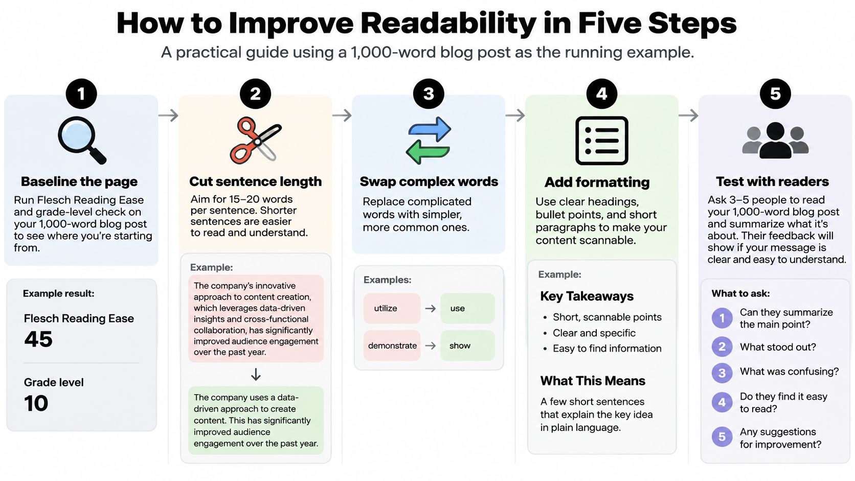
- Baseline the page (5 minutes). Run Flesch Reading Ease and grade level, note average sentence length, and list the five hardest sentences verbatim. A sample post might come in at 45 Reading Ease and grade 10. The list is what makes your improvement provable later.
- Rewrite the highest-load sentences (15 minutes). Drag the average to 15 to 20 words. Convert passive constructions to active, break noun stacks like "the optimization of conversion funnels" into verbs, and swap jargon for plain terms. When a technical term has to stay, define it in one clause at first use.
- Restructure for scanners (10 minutes). Put the answer in the first two sentences. Give every paragraph one idea and a topic sentence up front. Rewrite H2s so they state a takeaway instead of labelling a topic, and convert any run of parallel items into bullets.
- Format the page (5 to 10 minutes). Body text at 18 points or larger, roughly 24 CSS pixels, moderate line spacing, clear white space between sections, and bold reserved for the few phrases that carry the decision.
- Test comprehension (5 minutes). Hand the page to one target reader and ask them to paraphrase the main action. Recheck the score, then keep whichever version the reader understood.
Step three is where most of the gain lives. In Nielsen Norman Group testing reported in that same federal plain language guidance, 79% of users scanned each new web page while only 16% read word by word. Restructuring assumes that behavior rather than fighting it. Nielsen Norman Group's five-version test of the same site puts a number on the combination: concise, scannable, and objective writing together produced a 124% usability improvement over the control (Nielsen Norman Group).
The gate I use: every section has one purpose, its first sentence carries the takeaway, the key action is visually extractable, and a target reader can restate the required action without help.
Fail any one of those four and the page isn't done, regardless of what the score says. If you're pushing these edits through an automated workflow, the AI-driven content optimization tactics behind this kind of pass are worth understanding before you trust a pipeline to apply them.
Sentence-Level Edits With Before and After Examples
Start with the passive voice, because it hides the actor and adds words in the same move. "It was determined by the committee that the deadline would be extended" becomes "The committee extended the deadline." Twelve words drop to six, and the reader learns who did something.
| Before | After | What changed |
|---|---|---|
| It was determined by the committee that the deadline would be extended. | The committee extended the deadline. | Passive voice became active; 12 words became 6. |
| We provide comprehensive solutions for the optimization of conversion funnels. | We help you turn more visitors into customers. | Jargon and noun stacks replaced with a concrete outcome. |
| In order to utilize the new feature, users must first complete the onboarding process, which was designed by the product team to take less than five minutes. | To use the new feature, finish onboarding. It takes under five minutes. | Filler phrase cut, 'utilize' swapped for 'use', long sentence split into two. |
| Our platform leverages cutting-edge technology to facilitate seamless integrations. | Our platform connects your tools in minutes, no code required. | Buzzwords replaced with a verifiable claim. |
| The data, which was collected over a period of three years by researchers working across multiple institutions, suggests that users tend to scan rather than read. | Researchers spent three years collecting the data. Their finding: users scan rather than read. | Long relative clause split; key finding front-loaded. |
Five techniques cover almost every row. Turn passive into active so the actor leads. Replace noun stacks with verbs, so "conduct an evaluation of" becomes "evaluate" and "the implementation of" becomes "implement". Split anything past roughly 25 words into two sentences. Swap inflated words like utilize and facilitate for use and enable. Keep one idea per sentence, with subject and verb near the front.
Then vary the length, because uniform brevity reads like a metronome. Two long sentences followed by a three-word sentence land hard. A page of identical eight-word sentences feels choppy and machine-made even when every clause is correct.
The edge case matters more than the rule. Never delete a term your expert audience needs just to lift a score. "Latency" isn't jargon to an SRE, and "amortization" isn't jargon to a CFO. Define the term in a clause at first use, then keep using it. Oversimplification costs precision, and precision is the reason that reader showed up. If the draft came out of a model, run these edits as part of your pass to humanize AI-generated blog drafts instead of accepting the first generation as final.
Formatting Choices That Make Pages Easier to Scan
Wording fixes only reach a reader who can see the page comfortably. Layout is where a good rewrite gets thrown away by small type and dense blocks. Here's the layout pass in the order a reader meets it.
Work from the top of the page down
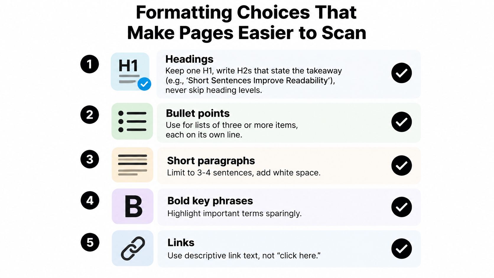
Headings. Keep one H1. Write H2s that state the takeaway rather than labelling a topic, and never skip a level, because heading order is also the navigation map for assistive technology. A reader scanning only your headings should be able to reconstruct the argument.
Paragraphs. One idea each, topic sentence first. On the web, two to four sentences is the working range. Split any block that runs taller than about four lines on a phone. The Federal Plain Language Guidelines put concrete ceilings on this: no more than 150 words and three to eight sentences per paragraph, and never above 250 words.
Lists and emphasis. Bullets for parallel options, numbered lists only where order matters, and bold on the handful of phrases that carry the decision. Bolding a full sentence removes the contrast that made bolding useful.
If you'd rather watch the layout pass than read it, this walkthrough covers the same ground.
Type size. This is the one layout choice with hard evidence behind it. In a 2016 eye-tracking experiment, 104 participants read Wikipedia articles set in Arial at sizes from 10 to 26 points with line spacing from 0.8 to 1.8. Readability improved significantly as size increased, participants answered significantly more questions correctly at 18-point or 26-point text than at smaller sizes, and the spacing extremes at both ends impaired reading (ACM eye-tracking study). Those are points, not pixels, which is why so many "18px body text" rules undershoot. 18 points is about 24 CSS pixels. Set body copy at 24px and treat 18px as the floor, not the target.
Line length. Desktop comfort sits around 45 to 80 characters per line, and no single typeface or size optimizes reading for every audience, so test rather than assume (Virtual Library research).
White space and alignment. Give every section room to breathe, keep a consistent left edge for Latin scripts, and check the page on a real phone instead of a desktop preview.
If the page needs two hands and a still screen to follow, the layout is doing damage the wording can't undo.
A ten-minute scannability check: one H1, takeaway H2s, no paragraph over four phone lines, bullets only where items are parallel, body text at 24px, and a phone test. These moves compound with the sentence edits rather than replacing them. For the structural side, The SEO Agent's blog SEO guide covers how headings and page architecture feed search performance.
Accessibility Checks That Extend Readability
Clean prose doesn't make a page usable for everyone. Finish every audit with five checks that determine whether a reader using assistive technology gets the same answer as a sighted one.
- Declare the page language. Set the default human language on every page and mark any passage that switches language, which WCAG requires so screen readers and text-to-speech tools pronounce it correctly (W3C WCAG).
- Keep the heading order sequential. One H1, then H2s and H3s in order, so people can jump between sections instead of listening to the whole page.
- Write link text that names the destination. "Compare the three pricing plans" beats "click here" every time, in a screen reader and out of one.
- Describe images and charts. Give informative images alt text, and add a short summary under each chart that states what the data means, not what it looks like. A 2025 accessibility study found inaccessible data visualizations left screen-reader users 61% less accurate at extracting information and required 211% more interaction time than non-screen-reader users (ACM accessibility study).
- Define unusual words, idioms, and abbreviations at first use, and offer a simplified summary for dense passages, as W3C guidance recommends.
Alternative text is usually the weakest link. A 2025 multilingual-web measurement study analyzed accessibility text across 12 HTML elements and found enough gaps to argue for auditing it as a standing task rather than a one-time cleanup (arXiv measurement study). Run a keyboard-only pass and a screen-reader pass, then confirm the headings alone outline the argument. If they don't, the structure needs work before the copy does.
Test With Readers and Make the Check a Habit
A score tells you a formula ran. A reader tells you whether the page worked. The four tests below run from fastest to most rigorous, and the last one is the only one that decides whether an edit ships.
- Recheck the score. Expect Reading Ease to rise and grade level to fall. Treat it as a smoke test and nothing more. Our Reading Level Checker reports Flesch Reading Ease and Flesch-Kincaid Grade for the whole text and flags the top five hardest sentences, computed in the browser, which shortens this step to seconds.
- Run a paraphrase test. Give the page to three to five target readers and ask them to restate the main action in their own words. Where the paraphrases drift, the sentence causing it is usually buried, overloaded, or vague. Plain-language guidance recommends exactly this method for catching misinterpretation.
- Run a task check on money pages. Give one job, such as finding the price or the next step, then record completion, time, and errors. Sentence and word length predict processing effort cheaply, but they don't substitute for watching someone try (Language Learning study). For high-stakes material, test the original against the rewrite and keep whichever improves the task outcome.
- Run a five-second test on landing pages. Show the headline and first paragraph for five seconds, then ask what the offer was. If nobody can answer, the top of the page is the problem, not the body copy.
The evidence that this matters is direct. A plain-language court-form study found comprehension of one treated form rose to 77% from 66% for the untreated version, significant at the 95% confidence level (Language Learning study).
Keep the version that improves the task, not the one that improves the number.
Don't over-shorten in the other direction either. Cutting definitions, connectives, or necessary qualifications can lift a formula while lowering comprehension, and that trade is worst in health, finance, software, and legal content where the qualification is the point.
Then make the loop a habit rather than a project. Score the page, rewrite the five hardest sentences, format for scanning, verify with one reader paraphrase, and put that check on the pre-publish list beside SEO and proofreading. A 1,000-word post takes 30 to 45 minutes. Run it first on your worst-performing page that already gets traffic, because fixes there compound fastest.
Today, pick one page. Run the five steps, then put the before-and-after score next to a reader's paraphrase of the main action and see which one tells you the truth.
The SEO Agent handles keyword research, drafting, sourcing, and publishing in one pipeline, and an editing pass smooths the prose so it reads naturally before anything goes live. You can edit any draft, change the publishing cadence, or turn off automatic publishing so every article waits for your review. Visit The SEO Agent to see how that readability work holds up across a whole site rather than a single page.